

 SB Genus
 21 Aug 2026
Why Web Application Development Matters in Today’s Digital Landscape
21 Aug 2026
Why Web Application Development Matters in Today’s Digital Landscape


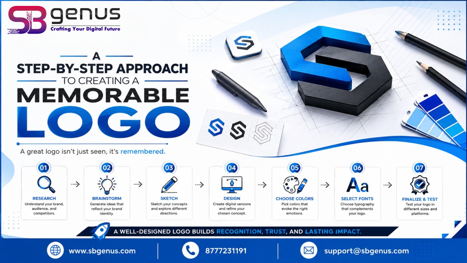
A logo is more than just a graphic placed beside a company name. It is one of the most recognisable elements of a brand and often creates the first visual impression in the minds of customers. A well-designed logo can communicate a company's personality, values and professional identity without requiring a lengthy explanation. From global corporations to small businesses, memorable logos play an important role in building brand recognition and trust.
Creating a memorable logo, however, is not simply about choosing an attractive icon or an interesting font. Effective logo design requires strategic thinking, creativity, research and an understanding of the brand. The best logos are usually simple enough to recognise immediately while being distinctive enough to remain memorable.
The first step towards creating a memorable logo is understanding the brand itself. Before opening any graphic design software, a designer should know what the business represents, what it offers and how it wants customers to perceive it. A technology company, for example, may want to communicate innovation and reliability, while a children's educational brand may prefer to appear friendly, creative and approachable.
Understanding the brand's mission, values, personality and long-term goals provides a strong foundation for the design process. The logo should feel like a natural visual representation of the business rather than an unrelated decorative element.
A logo should be designed with a specific audience in mind. Different audiences respond to different visual styles, colours, symbols and typography. A luxury fashion brand may require an elegant and sophisticated identity, whereas a sports company may benefit from a bold and energetic appearance.
It is therefore important to determine who will see the logo and where they will encounter it. A logo used primarily on websites and social media may need to work particularly well on digital screens, while a company that uses extensive outdoor advertising may require a design that remains clear from a distance.
Defining the purpose and audience ensures that the logo communicates with the right people instead of simply looking attractive to the designer.
Research is an important part of professional logo design. Studying competitors helps designers understand the visual language already being used within an industry. It also helps identify opportunities to create something distinctive.
For example, if most businesses in a particular sector use similar blue icons and conventional typography, introducing a different but appropriate visual direction may help a new brand stand out. However, competitor research should never become an exercise in copying. The objective is to understand the market, identify trends and discover ways to create a unique identity.
A memorable logo should be recognisable on its own and should not be confused with another company's branding.
Once the brand and market have been researched, the next stage is developing a central concept. A strong concept gives meaning and direction to the logo.
Designers can begin by exploring words, ideas, symbols and visual associations connected with the brand. Sketching different concepts on paper can be useful because it allows ideas to develop naturally without being restricted by software tools.
The strongest concept is not necessarily the most complicated one. Sometimes a simple visual idea can communicate a brand's message more effectively than a detailed illustration. A meaningful shape, clever negative space or carefully designed symbol can make a logo memorable while keeping it visually clean.
Typography can dramatically influence the personality of a logo. Serif fonts can create a traditional or sophisticated impression, while sans-serif fonts often communicate modernity and simplicity. Handwritten or custom lettering can provide a more personal and creative character when appropriate.
The selected typeface should complement the brand rather than overpower the symbol. Readability is also essential, particularly when the logo is displayed at small sizes.
In some cases, creating custom lettering can make the identity more distinctive. However, even when using an existing typeface, thoughtful adjustments to spacing, proportions and alignment can make the final logo feel unique.
Colour is another powerful element of logo design because people often associate colours with particular emotions and ideas. Blue can suggest trust and professionalism, green may be associated with nature or growth, while red can communicate energy and urgency. Black and white can create a sophisticated and timeless appearance.
Choosing colours should therefore be based on the brand's personality rather than personal preference. A logo should also work effectively without colour. This is particularly important because logos may appear in black-and-white documents, photocopies, stamps, merchandise and other situations where the original colour palette is unavailable.
A carefully selected colour palette can strengthen brand recognition while maintaining visual consistency across different marketing materials.
Simplicity is one of the most important principles of memorable logo design. A logo containing too many details may look impressive when displayed large but become difficult to recognise when reduced in size.
Simple logos are easier to remember, reproduce and apply across different platforms. A strong logo should work on a website, business card, social media profile, signboard, packaging and promotional material without losing its identity.
Versatility is equally important. The design should remain effective in different sizes, backgrounds and formats. Creating appropriate variations, such as horizontal, vertical, icon-only and monochrome versions, can help maintain consistency across different applications.
After developing the concept, designers can create digital versions and begin refining the visual details. This stage involves adjusting proportions, spacing, alignment, typography, shapes and colour combinations.
The first version of a logo is rarely the final version. Good design often comes from repeated refinement. Unnecessary elements should be removed, visual relationships should be improved and every part of the logo should have a purpose.
It is also useful to step away from the design and review it with fresh eyes. Feedback from colleagues, clients or representative members of the target audience can reveal issues that may not be immediately obvious to the designer.
Before finalising a logo, it should be tested in real-world situations. Place it on a website header, social media profile, business card, letterhead, advertisement and other relevant brand materials. This helps determine whether the design remains effective outside the design workspace.
The logo should also be viewed at both large and small sizes. If important details disappear when the logo is reduced, the design may need to be simplified.
Digital testing should also include different screen backgrounds and devices. A logo that looks excellent on a large monitor may not have the same impact as a small social media profile image.
Creating a memorable logo is a strategic and creative process that goes far beyond drawing a symbol. It begins with understanding the brand, defining its audience and researching the competitive environment. From there, a designer develops a meaningful concept, chooses appropriate typography and colours, and transforms the idea into a simple and versatile visual identity.
The most effective logos are distinctive, relevant, recognisable and adaptable. They do not depend on unnecessary complexity to attract attention. Instead, they communicate a clear idea in a way that customers can quickly understand and remember.
A memorable logo ultimately becomes more than a visual mark. It becomes a representation of the brand itself. When thoughtfully designed and consistently used, it can strengthen recognition, build credibility and create a lasting connection between a business and its audience.
A memorable logo is usually simple, distinctive, relevant to the brand and easy to recognise. Strong typography, meaningful colours and a unique concept can help customers remember it.
Simplicity makes a logo easier to recognise and reproduce across different sizes and platforms. A clean design is also more likely to remain effective over time.
Start by understanding the brand, its values, target audience and competitors. Once the brand direction is clear, develop concepts based on its personality and purpose.
Colour plays an important role in communicating emotions and brand personality. The right colour palette can improve recognition and create a consistent visual identity.
It depends on the brand's requirements. Many businesses use a combination of a symbol and wordmark, while established brands may successfully use an icon alone.
There is no fixed rule, but using a limited colour palette generally makes a logo cleaner and easier to reproduce. The logo should also work effectively in black and white.
The font should match the brand's personality and remain readable at different sizes. Serif, sans-serif, handwritten and custom fonts can all work when appropriately selected.
Trends can provide inspiration, but a logo should not depend entirely on them. A timeless design that represents the brand effectively is usually more valuable than a design that quickly becomes outdated.
A logo may appear on websites, social media, business cards, packaging, signage and promotional materials. A versatile logo maintains its visual identity across different formats and sizes.
A logo is a visual symbol or wordmark representing a business. Brand identity is much broader and includes the logo, colours, typography, imagery, messaging and overall visual style used to represent the brand.
A professional logo should have balanced proportions, clear typography, appropriate spacing and a strong concept. Avoiding unnecessary details and maintaining consistency can also improve its appearance.
An icon can make a logo more recognisable, but it is not always necessary. Whether an icon should be used depends on the brand, industry, audience and overall design concept.
Test the logo at different sizes and on different platforms. You can also gather feedback from people who represent your target audience to determine whether the logo is clear, distinctive and appropriate.
Yes. Businesses often refresh or redesign their logos as their products, audiences or market positioning evolve. A redesign should ideally retain recognisable elements of the existing identity when brand equity is important.
A professionally designed logo can create a strong first impression and provide a consistent visual foundation for marketing. It can help a business appear credible, distinctive and easier for customers to recognise.
Trusted Clients






























































.jpg)


.jpg)
.jpg)







.png)

SB Genus is a Kolkata-based tech company specializing in custom web development, app development, digital marketing, and startup growth.


© 2017-2026 SB Genus. All rights reserved.

.png)
.jpeg)
.png)


